Whether you’re running a conference, hosting a business lunch or managing a product launch choosing the right room layout for your event is really important. Getting it right will give you the platform to deliver your message to your audience in the most powerful way.
Here at W12 Conferences, we’ve had a lot of practice in doing just that, so we’ve put together this handy overview of the pros and cons of some of the most popular seating arrangements to make life easier for you. (Plus some clever tips you might not have thought of…)
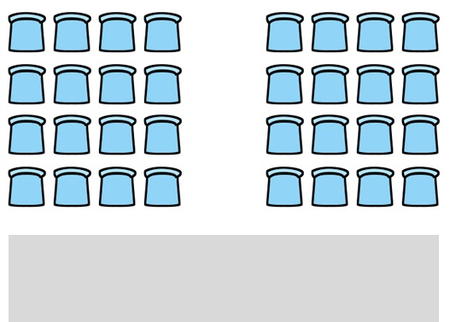
Description: Side-by-side seating arranged in rows facing the front of the room, often with at least one aisle, usually down the middle.
Benefits: This is a fantastic option for when you need to fit a lot of delegates into one space. Every seat faces forwards, which makes it ideal for events that have a main focal point like a presentation or a product launch.
Disadvantages: If you’re working with large numbers then visibility can become a problem for those sitting at the back. Theatre seating can also limit your attendees’ ability to interact with other delegates. People will also need to squeeze past each other to get out and serving food or drink is near impossible.
Tips: Don’t fall into the trap of trying to squeeze too many people into a small space, you still want your delegates to be comfortable and for it to be easy for them to get into their seats.
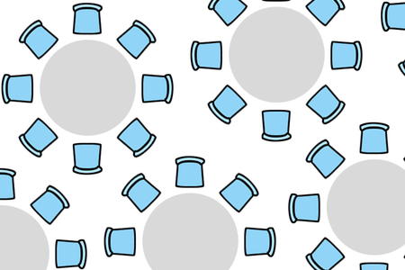
Description: Individual round or rectangular tables with guests facing inwards.
Benefits: The perfect layout for meals. No member of a table is preferred to another, and with everyone able to see each other it is easy for all to be involved in conversation.
Disadvantages: It’s not the best option for an event where everyone’s attention is required in a certain area of the room as guests will need to twist round or move their chairs to be able to see properly.
Tips: Avoid large centrepieces so guests on opposite sides of the table can chat.
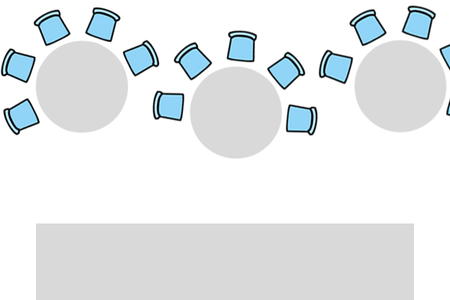
Description: Similar to banquet seating, but always with round tables with an open end (ie no chairs) which faces a focal point in the room.
Benefits: This is a great way to balance the ability to view a live event or presentation with the ability to talk about it with the rest of your table.
Disadvantages: An open-ended table might be great for your guests’ live experience, but it’s an inefficient use of floor space. Plus, guests at the end of the table may feel left out of conversations.
Tips: Make sure the gap you leave in the chairs is large enough so that no one has their back to the front of the room.
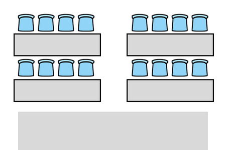
Description: Tables with forward-facing chairs on one side.
Benefits: With every seat facing forwards and plenty of room for note taking, this layout is great presentations, training sessions and lectures.
Disadvantages: With tables added into the mix your seating capacity is drastically reduced from a theatre-style layout. As with a theatre layout audience members can only chat to one or two immediate neighbours.
Tips: Leave plenty of space for your delegates to access their tables. Nobody wants to have to awkwardly squeeze into place.
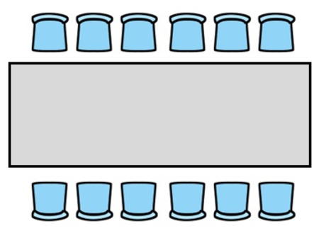
Description: One large rectangular table with guests seated along the sides.
Benefits: With everyone facing inwards this layout lends itself well to debate and discussion. All guests can get involved and there is the option for a focal point at the end of the table if needed. It’s a fantastic way to hold small meetings or team briefings.
Disadvantages: Any focal point is typically restricted to the end of a table making it more awkward for those in the middle or the opposite end to get involved.
Tips: Position whoever is leading or guiding your discussions at the head of the table so they stand out from the rest of the group.
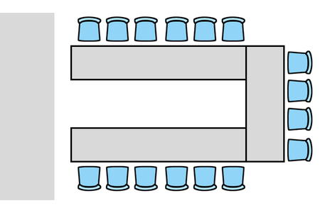
Description: Seats and tables are arranged in the shape of a U leaving an area of open space at one end.
Benefits: The open-ended layout leaves room for a clear presentation area or focal point. The U-shape keeps audience interaction high as everyone is facing towards the centre, and the tables make it easy for delegates to take notes.
Disadvantages: It’s quite an inefficient use of floor space and the majority of your audience will be sat side-on to the presentation area.
Tips: If your event features a presentation, encourage your host to move inside the U as much as possible to encourage audience participation and to keep them as visible as possible.
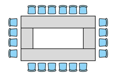
Description: A similar layout to the U-Shape, but without the open end.
Benefits: This is a great format for large-scale group interaction as everyone faces each other. With tables for all it’s easy to serve food or provide space for note taking.
Disadvantages: As with the U-Shape layout the use of floor-space is inefficient. The enclosed nature of the seating means that it’s almost impossible to have a presentation or display at the same time.
Tips: If you do want to include anything actually inside the square be sure not to obscure vision from one side to the other.